The Confidence of Crowds
By Peter Brock, September 5, 2025
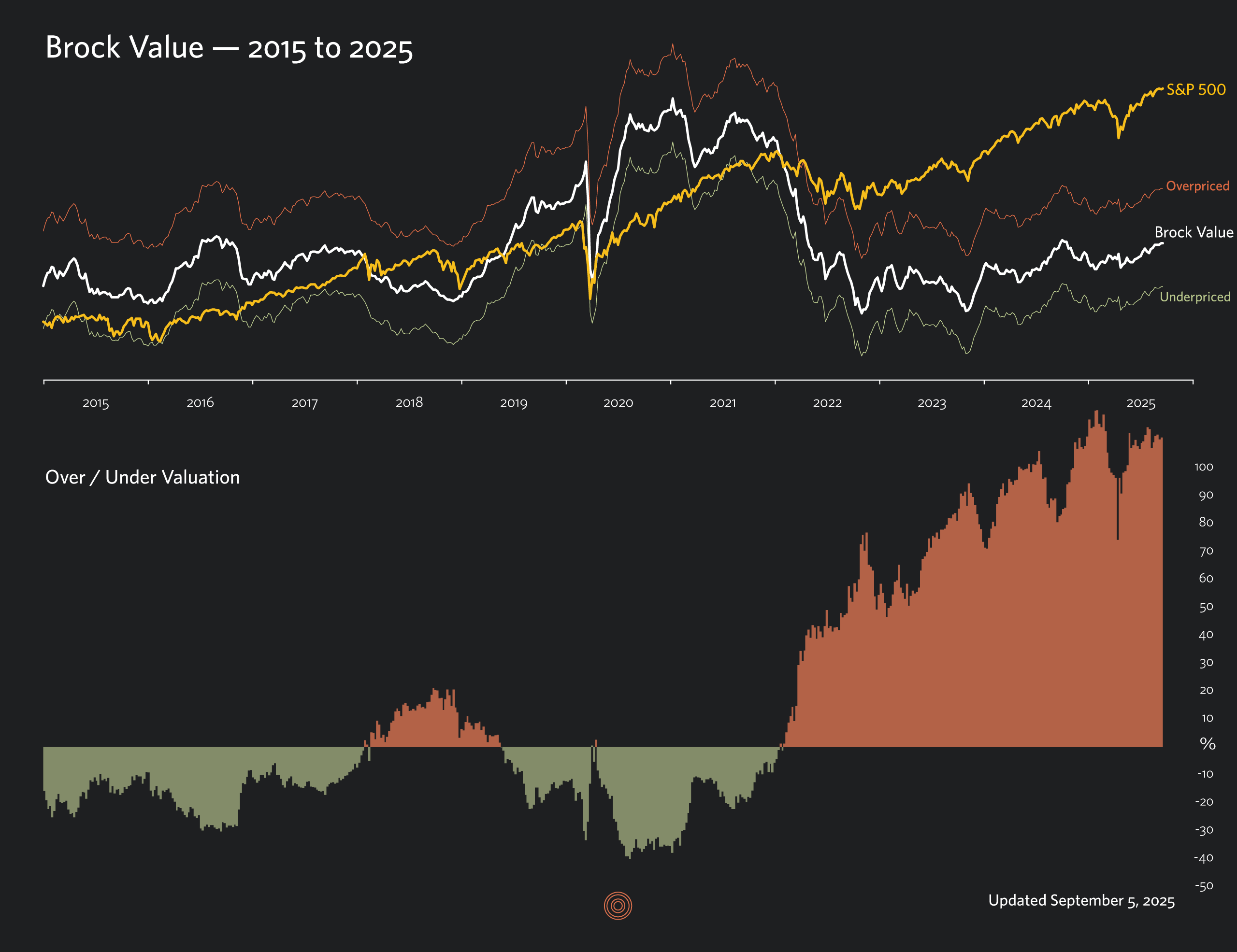
It was a choppy four weeks, with stocks having two little scares out of the blue and then moving on to new highs like they were nothing. Flat-lining corporate bond yields didn’t change the valuation picture much over the period. The market is running on fumes at this point, quite sure of itself and I’ve noticed a number of excited “this time is different” comments “because AI” on articles warning of historical parallels with 1929 and the Dot Com era twenty-five years ago. AI is definitely different but irrational exuberance is nothing new.
The S&P 500 started to trade in the BV danger zone on March 18, 2022 (when the S&P 500 was 4463). Based on historical relationships, the danger zone is above the red line on a BV chart. This is a risky place to be, where the market is vulnerable to larger than normal bear markets and ten-year expected returns are negative.*
*-1.2% per year over the subsequent decade (median compound annual real total returns, S&P 500, 1960-2024)
| US GDP (Est) | Corp Bond Yield | S&P 500 | Brock Value | Overpriced By |
|---|---|---|---|---|
| $30.552t | 5.05% | 6481.50 | 3024.99 | 114.3% |
Understanding Brock Value charts
Brock Value is the first clear answer to the question: what is the market worth? BV is a valuation metric with just two inputs: GDP and interest rates. Compared to questionable old-school metrics (and even popular ones like Shiller’s CAPE), BV provides reliable measurements, especially at critical turning points.

| Valuation | Return |
|---|---|
| Above Red Line | -1.2% |
| Fair Value | 6.4% |
| Below Green Line | 10.1% |
| Subsequent 10-year returns, median compound annual real total returns, S&P, 1960-2024 | |
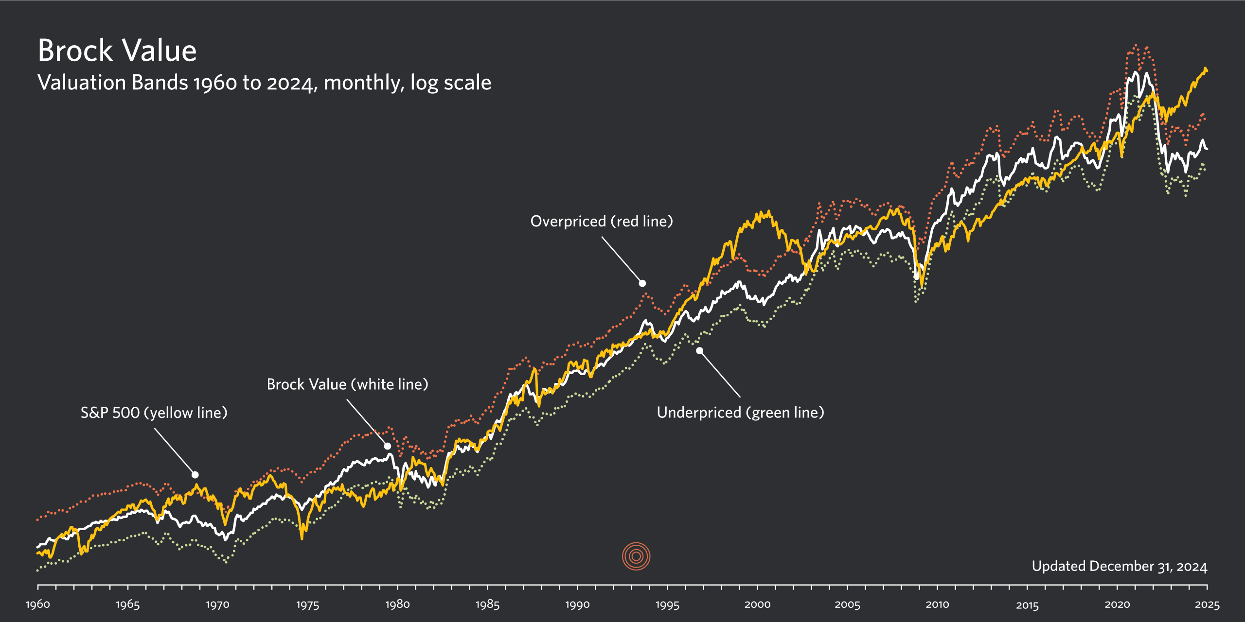
The red and green lines found on most of the Brock Value charts on this site indicate the normal range of the market. The red line indicates 30% overpricing, while the green line represents 20% underpricing. These guidelines serve as boundaries, beyond which valuation is extreme in one direction or the other. When the market (the yellow line) trades above the red line, it is highly overpriced. When this happens, my analysis shows that returns over the following ten years tend to be negative. Conversely, when the market trades below the green line, it is underpriced and returns over the next ten years will most likely be much higher than average.


